I currently work on Windows, where our team focuses on making your PC experience more powerful and delightful with AI, while also scaling new tooling across the studio.
I'm a self-taught designer with an engineering background, specializing in simple and effortless experiences for both the devices we use today and the ones we'll use in the future. Crafting high-quality products that people love to use is my passion, and I work tirelessly to achieve that goal.
Using the medium of motion and rapid prototyping I bring these experiences to life, visualizing the smallest interactions to entire user journeys. I strongly believe in open design, and encourage co-creation that can help deliver a better solution for users.
Accessibility and inclusion sit at the center of my process — technology should empower everyone and nobody should be left with a subpar experience.
I'm currently a Senior Designer at Microsoft, where I currently work on Windows AI.
Previously a Design Intern at Microsoft, where I was involved with products used by millions of people around the world. Check them out: Surface Duo, SwiftKey, Fluent Icons. Before that, I worked independently on critically acclaimed concepts both by myself and friends.
BSc Computer Science graduate — First Class Honours.
Awarded 2018-19 Microsoft MVP (Most Valuable Professional) for Windows Design.
Designing the navigation and management patterns that make Sets a system.
Not affiliated with Microsoft
Redesigning navigation for Windows 10 isn't affiliated with Microsoft. Concepts and mockups shown do not represent any product plans past, present, or future.
Sets is the most significant shell and app change Microsoft has shipped to Windows in years, but the navigation patterns inside Windows apps weren't designed for it. NavigationView elements fight tab strips for the top-left corner. App chrome breaks at the tab boundary, leaving a visible hard stop between system and app. And there are basic mechanics in Sets that still need fleshing out further.
This piece is an exploration of the patterns that would make Sets feel like a system rather than a feature bolted on top of the existing shell.
In-app navigation
The NavigationView pattern that ships with most current UWP apps puts primary nav on the left as a vertical rail. That worked when apps owned the full window. With Sets, it creates a conflict: the app's back button can't live in the title bar (Sets uses that space for tabs), and the left rail squashes against the tab strip's left edge.
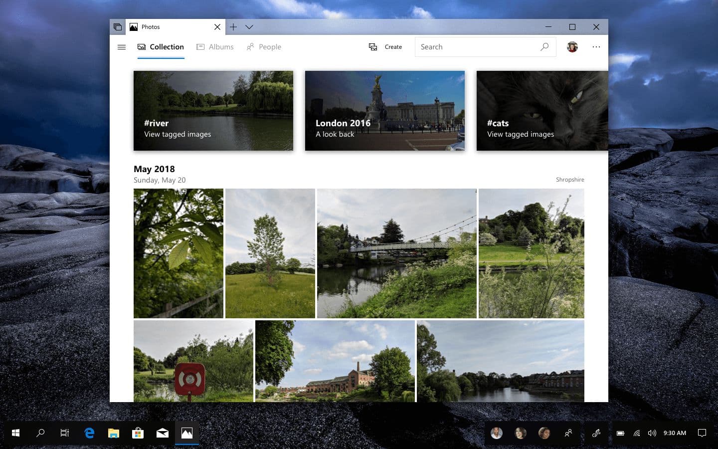
Moving in-app navigation to the top resolves both. Primary destinations sit in a horizontal row below the tab strip — 15pt Segoe UI, 16px icons offset 8px left of each label, with a back button to the far left when there's history to navigate.
Photos with a new top-mounted navigation row.
The Photos app demonstrates the pattern in a content-heavy app. The horizontal nav blends into the page background rather than sitting on a contrasting bar — there's no need for chrome separation when the destinations themselves are clearly labeled. The carousel and date headers below it get reorganized in the same pass for a cleaner overall rhythm.
When the window is narrow enough that the full nav can't fit horizontally, or when there are more destinations than horizontal space permits, a hamburger menu opens the rest in-app.
A hamburger menu in Photos showing additional categories and filters.
Hamburger menus sometimes get treated as a dead pattern in current design discourse, but it's not the pattern that's dead. It's the placement. As primary navigation on phones, the hamburger is awful because it hides the entire app structure behind a single icon. As an overflow surface for an app whose primary nav is already visible above it, it's exactly the right tool: familiar, predictable, and out of the way until needed.
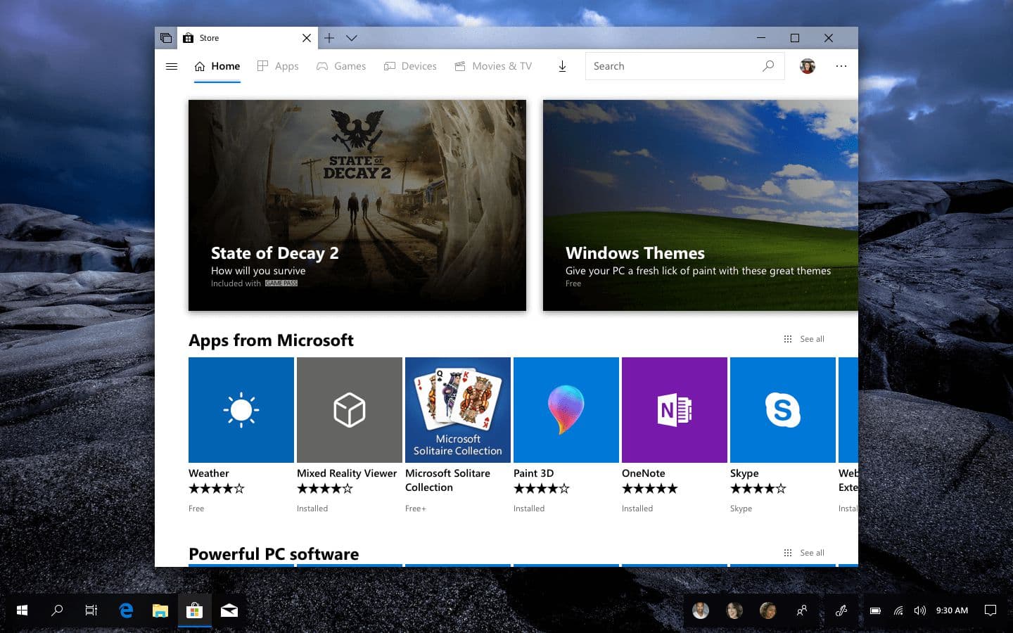
The Microsoft Store with the same nav pattern, tailored to its content.
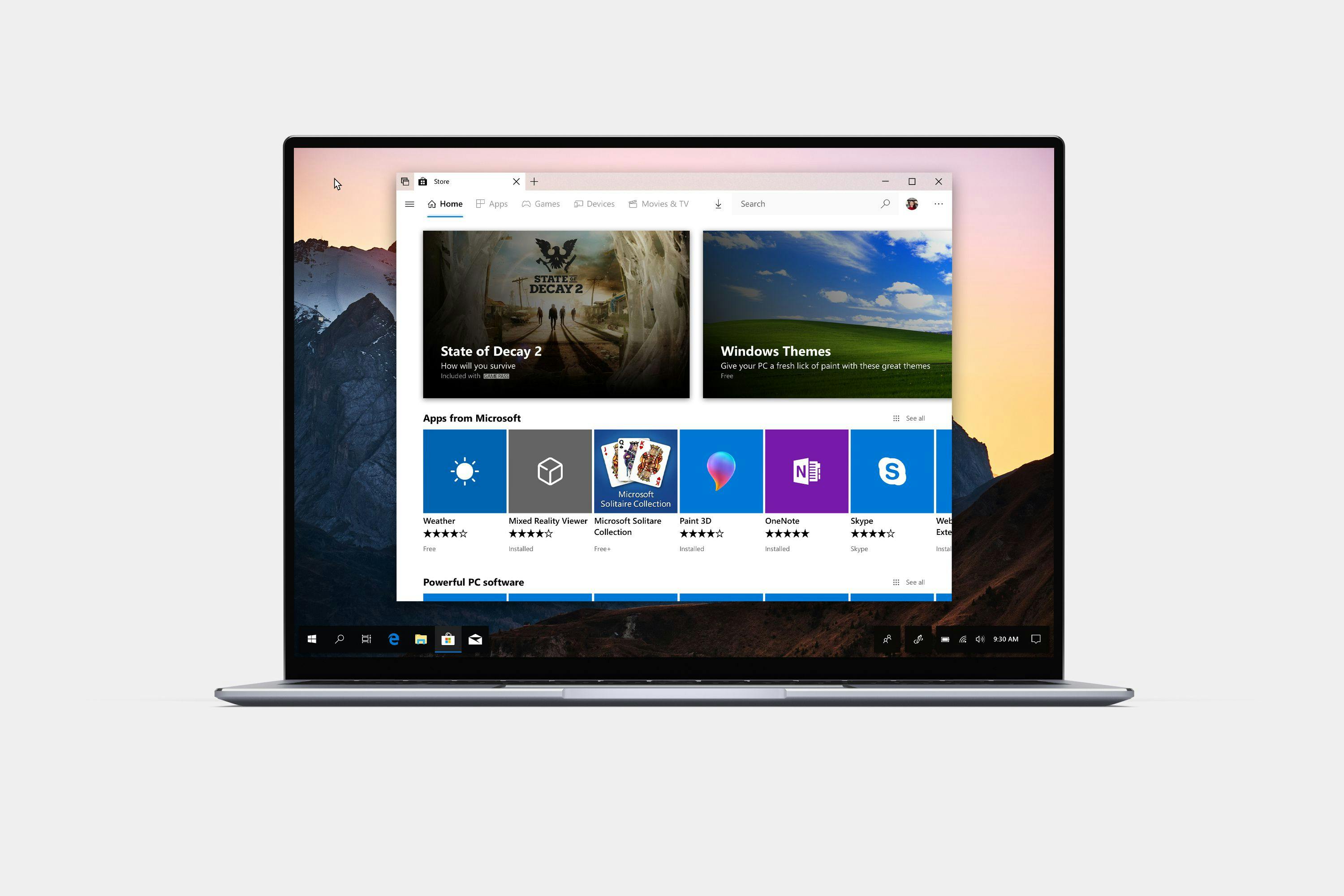
The Microsoft Store applies the same pattern. Featured content sits in a card-based carousel that adapts to category, with the same horizontal nav above and a hamburger for extended filters.
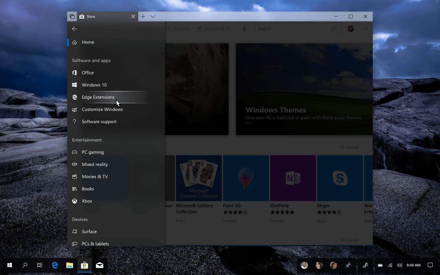
The Store hamburger menu with category filters and content types.
Brand expression
A system pattern is only valuable if third-party apps will actually adopt it. The test is whether a strong brand can pick it up without losing its identity.
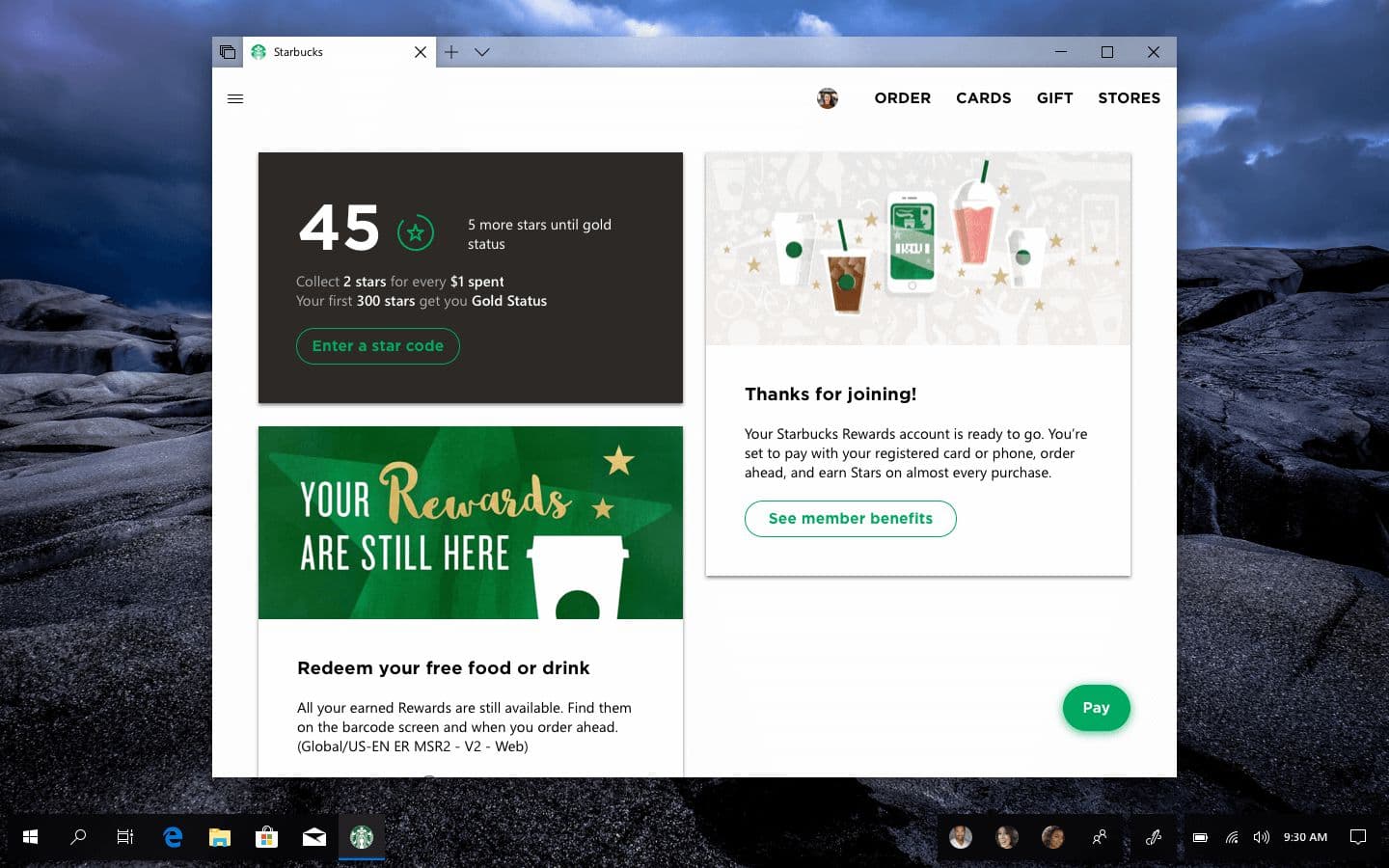
A Starbucks UWP concept using the same nav pattern, adapted to the brand.
Starbucks adapts well. The horizontal nav drops the iconography (the brand's web app doesn't use icons in nav, and forcing them in would feel uncanny), uses the Starbucks corporate font for areas of emphasis while keeping Segoe UI for body content, and renders account info as a card feed of the kind the brand already uses in its mobile app.
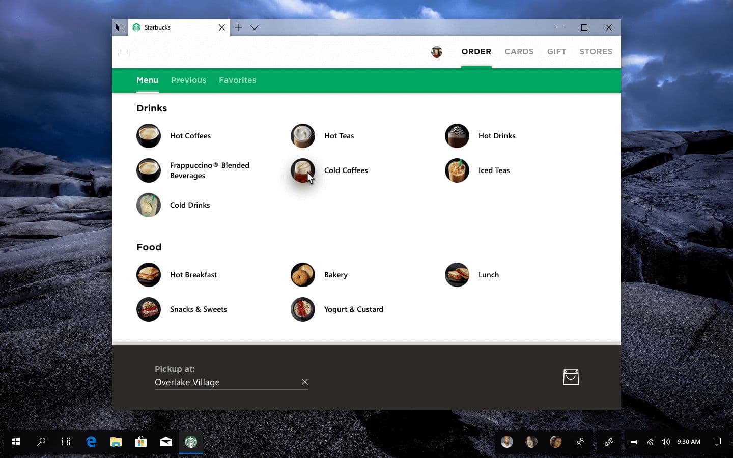
The Starbucks ordering page with a secondary horizontal nav below the primary.
The ordering page extends the pattern by adding nested navigation with a secondary horizontal nav below the primary one, separated by shadow and brand color rather than being a sibling. This keeps the structure feeling system-native yet with a visual design that unmistakably belongs to the brand.
The seam between app and Set
A subtler design problem: the visual boundary between an app and the Sets tab above it.
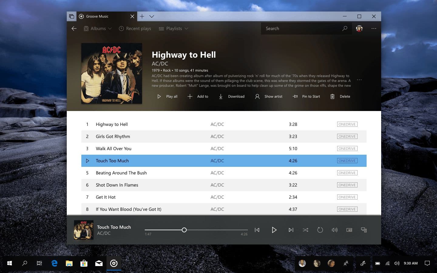
Groove Music’s album art bleeding through the nav and into the Sets tab.
In the default pattern, the tab strip is system chrome with a different material than the app below. That's correct as a default, but it leaves a hard horizontal seam at the tab boundary. The app stops here, the system starts there. For apps whose identity is visual (Groove Music, with its album art as the dominant element of the now-playing surface), that seam interrupts the content.
Letting app imagery bleed through the navigation row and up into the Sets tab itself collapses the seam. The tab still functions as a system control, but its texture comes from the app. Apps that have something worth showing get the full client area; apps that don't fall back to the default treatment.
Working with Sets
The patterns above assume Sets exists as a usable feature. But the actual mechanics of building and modifying a Set are still in flux, and the existing flow (drag a tab from one window into another) is a discovery problem rather than a usability one.
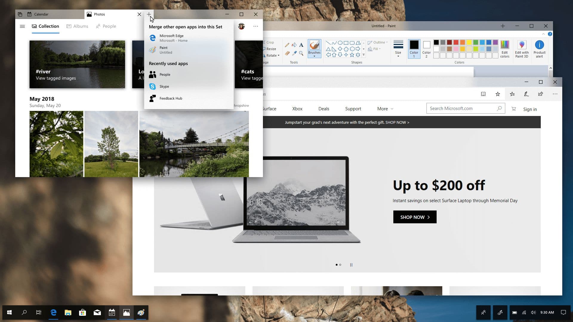
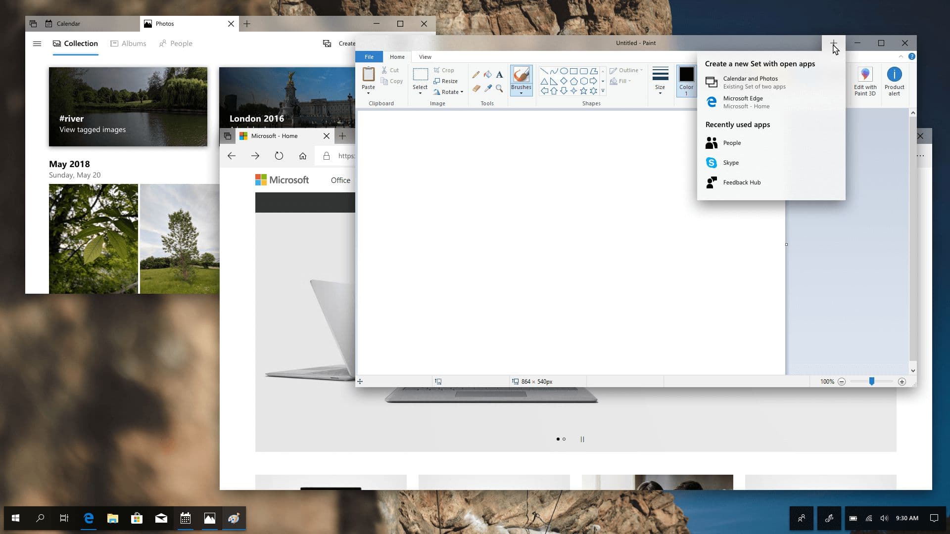
A dropdown next to a new tab button, showing other open apps that can be merged into the current Set.
Hovering or right-clicking the new-tab button surfaces a dropdown of apps that can be added: other open windows that aren't yet part of a Set, plus a few recents the user might want to launch directly into the group. The example shows Paint and Edge as candidates to join an existing Set of Calendar and Photos.
The same dropdown adapted for creating a new Set from existing apps.
The same affordance works in reverse for creating a Set. Hovering the new-tab button of a single-tab window offers the apps that can be merged in to create a group. The same interface, but contextual to whether the user is adding to a Set or creating one.
These are small surfaces, but they're where Sets actually becomes useful. Without them, Sets is a feature only power users will discover. With them, it's the new default way to organize related work on the desktop.