I currently work on Windows, where our team focuses on making your PC experience more powerful and delightful with AI, while also scaling new tooling across the studio.
I'm a self-taught designer with an engineering background, specializing in simple and effortless experiences for both the devices we use today and the ones we'll use in the future. Crafting high-quality products that people love to use is my passion, and I work tirelessly to achieve that goal.
Using the medium of motion and rapid prototyping I bring these experiences to life, visualizing the smallest interactions to entire user journeys. I strongly believe in open design, and encourage co-creation that can help deliver a better solution for users.
Accessibility and inclusion sit at the center of my process — technology should empower everyone and nobody should be left with a subpar experience.
I'm currently a Senior Designer at Microsoft, where I currently work on Windows AI.
Previously a Design Intern at Microsoft, where I was involved with products used by millions of people around the world. Check them out: Surface Duo, SwiftKey, Fluent Icons. Before that, I worked independently on critically acclaimed concepts both by myself and friends.
BSc Computer Science graduate — First Class Honours.
Awarded 2018-19 Microsoft MVP (Most Valuable Professional) for Windows Design.
Rebuilding SwiftKey's Figma libraries after the Surface Duo redesign.
I joined Microsoft SwiftKey just as the Android app was going through a significant redesign in the lead-up to Surface Duo with a more minimal UI direction, and a new set of components and layouts that would ship on regular Android too. The Figma library hadn't kept up.
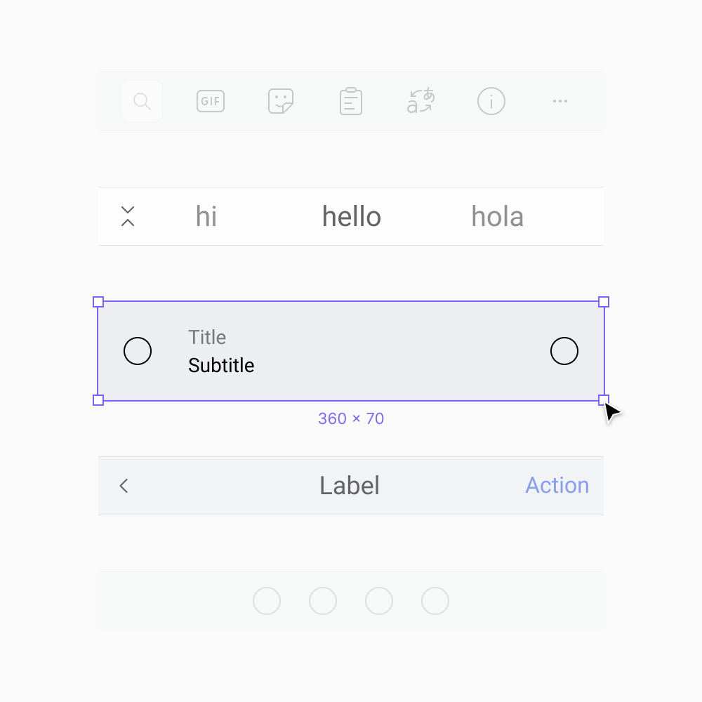
Components were visually wrong against the new design, structurally missing the Duo additions, and scattered across multiple files. The base widths were also an arbitrary number that didn't match the 360px standard the rest of Fluent mobile was working to, which made cross-team reuse painful.
Duo was the forcing function. We had just done all the redesign work; now was the moment to centralize it.
I led the rebuild on the Android side, working alongside the designer who owned iOS. Together we also scaffolded the cross-platform foundations: color, typography, and the shared primitives each platform library consumed. This let us move on the platform-specific libraries in parallel without stepping on each other.
Rebuilding against the product
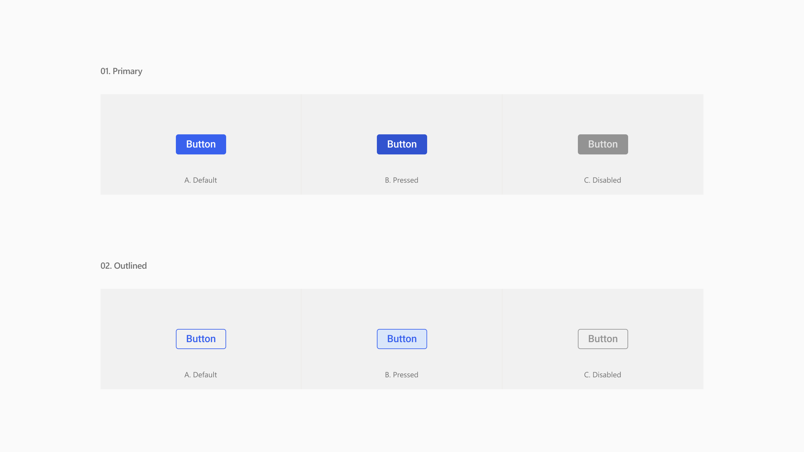
Keyboard panel buttons from the Android component library.
The Android library covers the keyboard surface itself and the settings app around it. Both needed rebuilding from scratch to match what was actually shipping, including the new layouts and controls Duo had introduced.
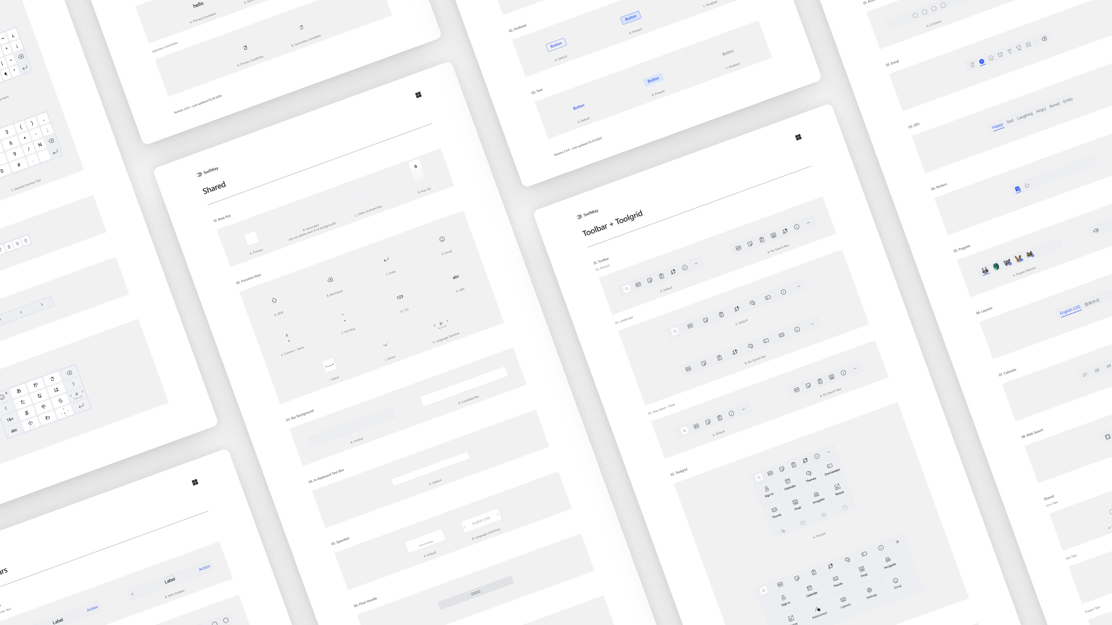
The library scales to hundreds of components and styles.
The rebuild was also a chance to adopt the Figma features that hadn't existed when the team first set the library up. Auto Layout was the biggest shift: components hold their visual correctness automatically as content changes, so designers stop manually nudging headers and icons to keep a screen looking right. The cost is the up-front rigor of structuring every component properly. The payoff is screens that stay aligned to the source of truth without constant tending.
Theming as a system
The keyboard's whole identity is themable, and the library had to make that fast.
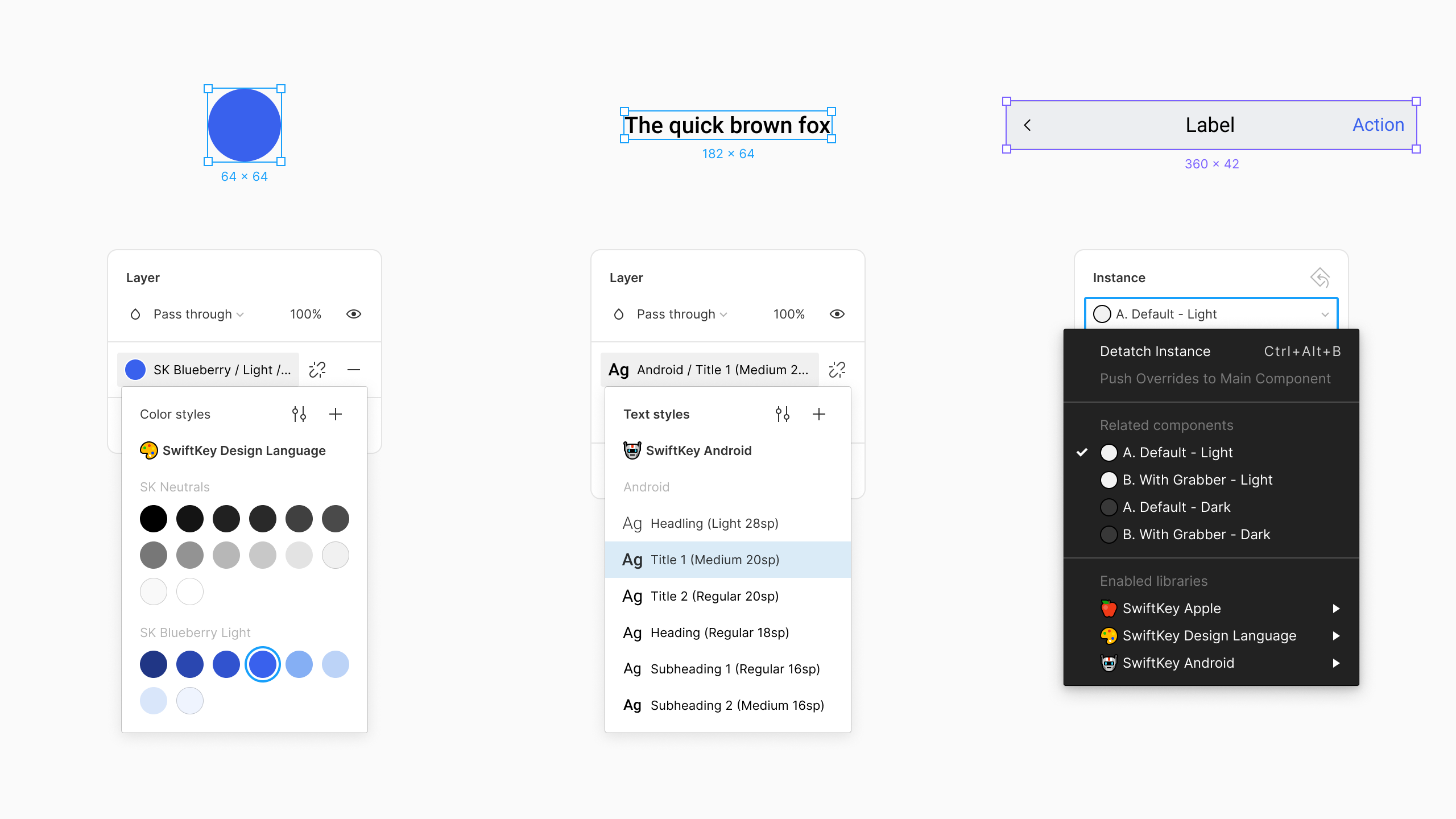
Color styles, typography ramp and components are all neatly organized to make it quick and easy for our designers to get going.
Every keyboard component is built off a small set of core variables: surface colors, accent colors, key shapes. Updating a theme is a matter of changing those in one place rather than touching every component on every screen. By duplicating the library, a designer can scaffold an entirely new theme in minutes and iterate inside Figma before committing to building it in our internal theming tool to see it on device.
Iconography
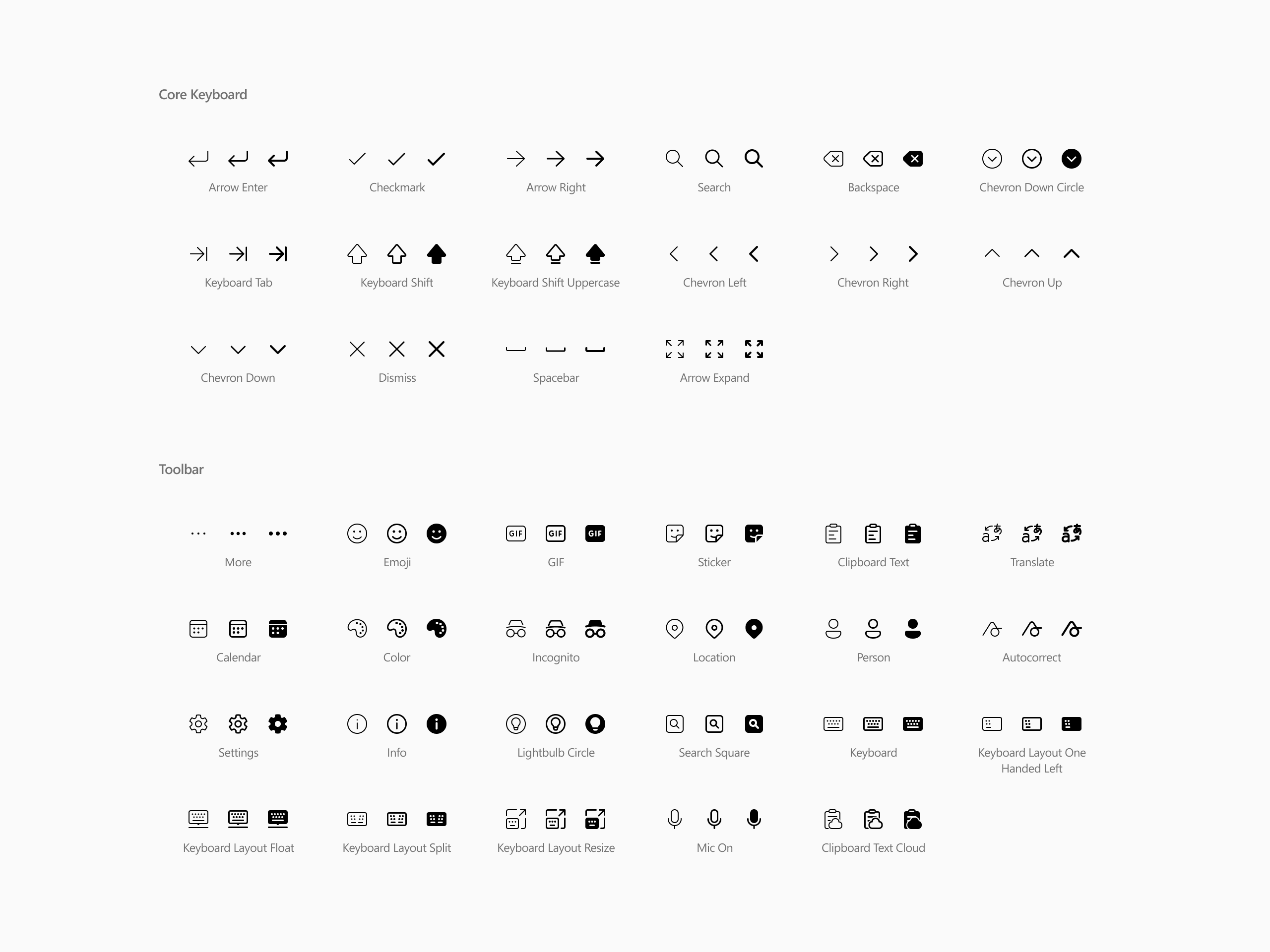
Our design language contains all of the Fluent Icons needed for SwiftKey.
As part of the alignment work, SwiftKey adopted a custom thin weight of Fluent Icons, drawn specifically for the keyboard's lighter visual register. That work is covered in more depth on the Fluent Icons page.