I currently work on Windows, where our team focuses on making your PC experience more powerful and delightful with AI, while also scaling new tooling across the studio.
I'm a self-taught designer with an engineering background, specializing in simple and effortless experiences for both the devices we use today and the ones we'll use in the future. Crafting high-quality products that people love to use is my passion, and I work tirelessly to achieve that goal.
Using the medium of motion and rapid prototyping I bring these experiences to life, visualizing the smallest interactions to entire user journeys. I strongly believe in open design, and encourage co-creation that can help deliver a better solution for users.
Accessibility and inclusion sit at the center of my process — technology should empower everyone and nobody should be left with a subpar experience.
I'm currently a Senior Designer at Microsoft, where I currently work on Windows AI.
Previously a Design Intern at Microsoft, where I was involved with products used by millions of people around the world. Check them out: Surface Duo, SwiftKey, Fluent Icons. Before that, I worked independently on critically acclaimed concepts both by myself and friends.
BSc Computer Science graduate — First Class Honours.
Awarded 2018-19 Microsoft MVP (Most Valuable Professional) for Windows Design.
Fluid Desktop isn't affiliated with Microsoft. Concepts and mockups shown do not represent any product plans past, present, or future.
The Windows 10 shell isn't broken. It's cluttered.
A taskbar that's accumulated chrome since 1995. A system tray overflowing with applets that have no relationship to each other. Cortana wedged into the search box next to Start despite being a conversational product. The pieces individually are fine; the surface as a whole is louder than it needs to be.
Fluid Desktop reworks the shell around two principles: cleaner, and more intelligent.
A cleaner shell
The system tray was the entry point. I'd written about reworking it a year earlier: collapsing overflow icons into a flyout I called Quick Actions, applying the same visual language across the tray and Action Center, and leaving only essentials in the row itself. The rest of the shell follows from that work.
The taskbar floats
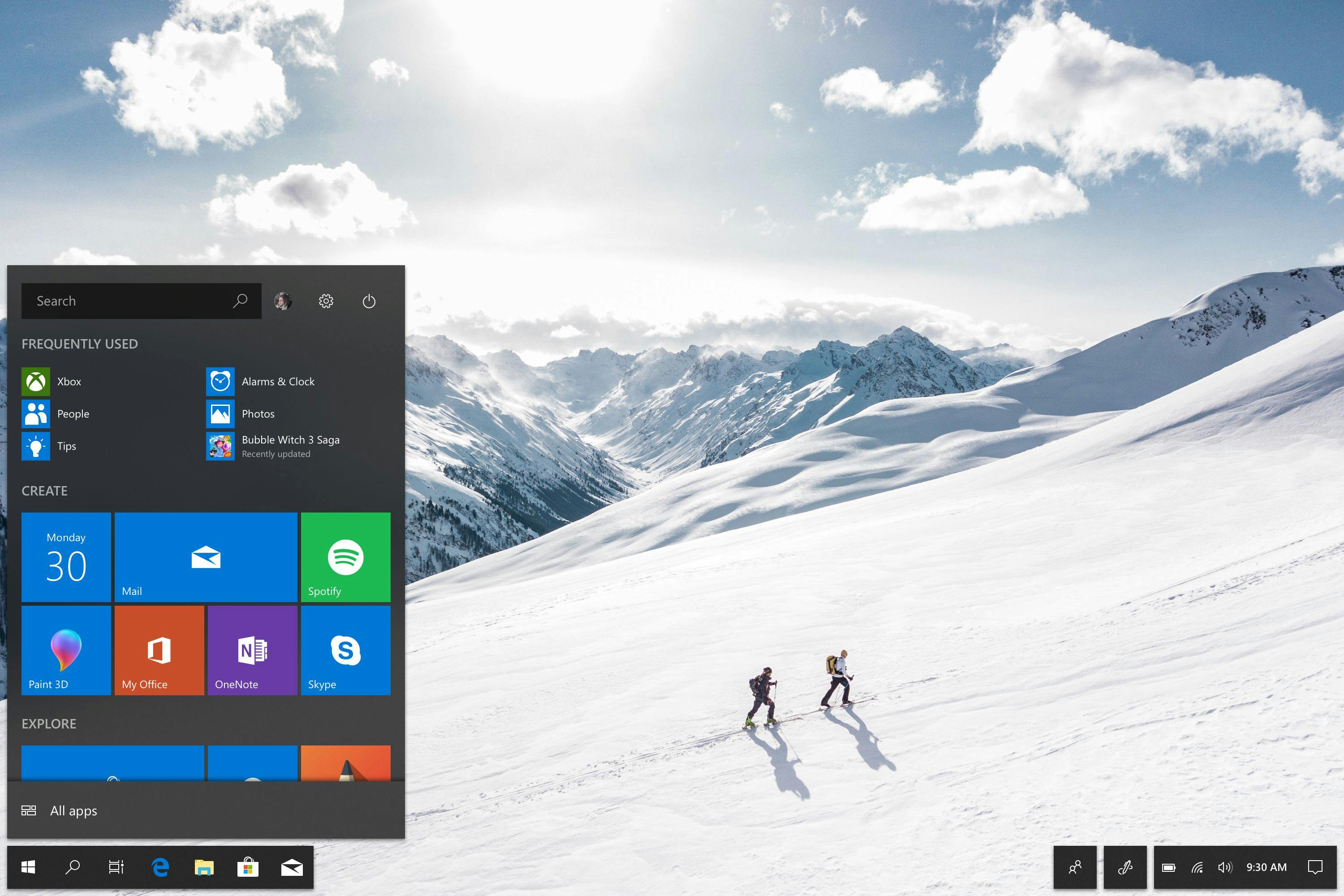
The floating taskbar.
Once the system tray was lighter, the taskbar itself became the question. I wanted to give it space to breathe. Detaching it from the screen edge and floating it (an idea Chrome OS had been quietly proving) opens the surface and lets the two halves of the bar — apps on one side, system status on the other — become dedicated zones rather than a single heavy strip.
The People button moves out into its own zone for the same reason. In the current taskbar, People and the system tray are crammed into one location, which makes neither read as a clear surface. Pulling them apart gives each a single job and the bar reads more legibly as a result.
The floating taskbar raises one obvious concern: the Start button is no longer in the corner, so the corner-target behavior the entire Windows population has muscle memory for breaks. The fix is geometry rather than placement. The Start button's hit target extends into the empty space beyond it, all the way into the corner. The cursor stops at the screen edge; clicking anywhere in that bottom-left region opens Start. The behavior is preserved without anchoring the chrome to it.
Tablet mode can benefit too. A floating taskbar can drift off the bottom edge and reveal on swipe, which fits how Windows 8 handled tablet apps better than Windows 10's "keep the taskbar visible" approach.
Start
An updated Start menu sized to the new shell.
Start gets a proportional rework where it's now sized to the floating taskbar, with the search box integrated at the top of the menu rather than tacked onto the bottom edge of the screen. The current arrangement places search adjacent to Start but visually separated from it; pulling search into Start means the user looks in one place for "the thing I want to launch or find," not two.
Sets, with one careful exception
Microsoft's Sets feature lets users group related apps into a tabbed window. Fewer windows on screen, fewer things demanding attention. That maps cleanly onto the cleaner-shell thesis, but it raises a question on the taskbar: do the apps in a Set appear scattered, or grouped?
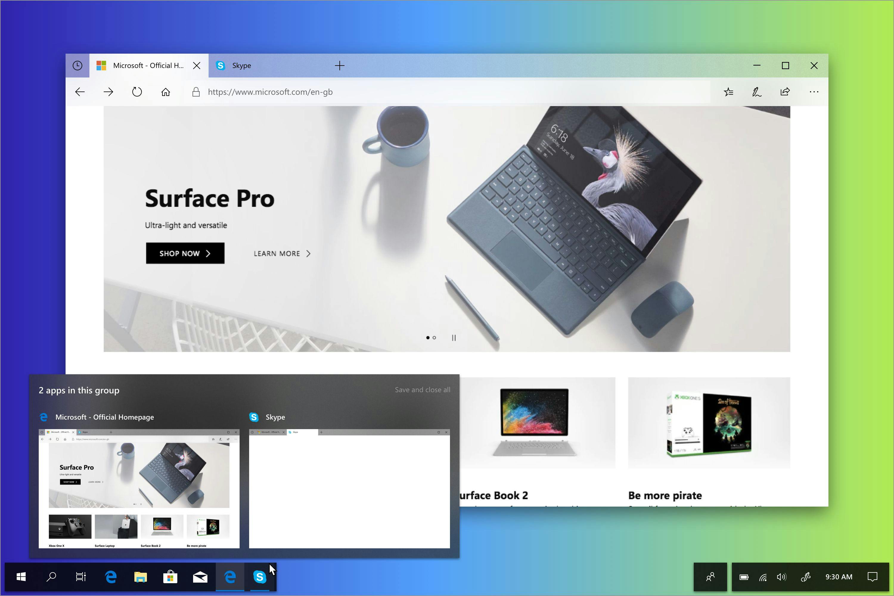
Grouped, with a small visual cue.
Set tabs previewed on the taskbar.
Hovering a Set on the taskbar reveals its tabs as a popover, so the user can jump to a specific app in the group without having to surface the whole window first.
But the Sets pattern breaks down on small utility apps. For example, Calculator with a tab strip on top makes no sense. There's no other content the user is moving between. The fix is to move the new-tab button into the window caption controls alongside the existing minimize/maximize/close buttons. That way apps without an active tab strip can still be added to a Set and Sets stays a universal pattern rather than an opt-in one, which is what makes it valuable as a shell-level concept.
A more intelligent shell
The other thing the current shell does poorly is Cortana. She's a conversational assistant living inside the search box next to Start, which is the worst of both worlds — neither prominently a conversation surface nor neatly out of the way.
The Spring Creators Update is already starting to move Cortana's "cards", such as calendar suggestions, reminders, and the rest, into Action Center. Fluid Desktop finishes that move.
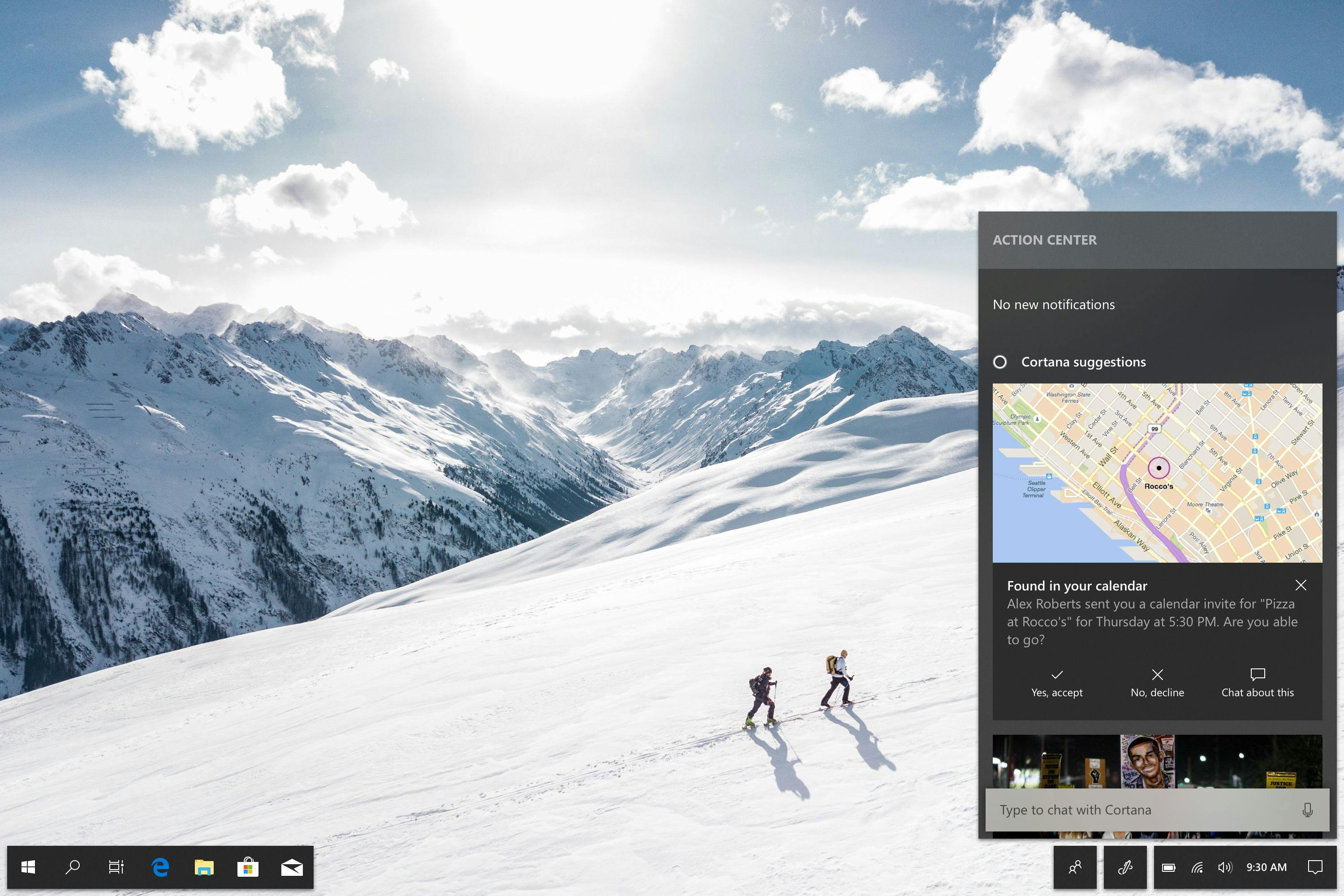
Intelligent Action Center in Fluid Desktop.
Action Center becomes the place where proactive intelligence lives. Notifications come first; below them sits a stream of suggestions Cortana surfaces from context: calendar events, weather alerts, reminders, activity from nearby devices, local news. The same surface that's already showing the user new information becomes the place where the assistant offers it.
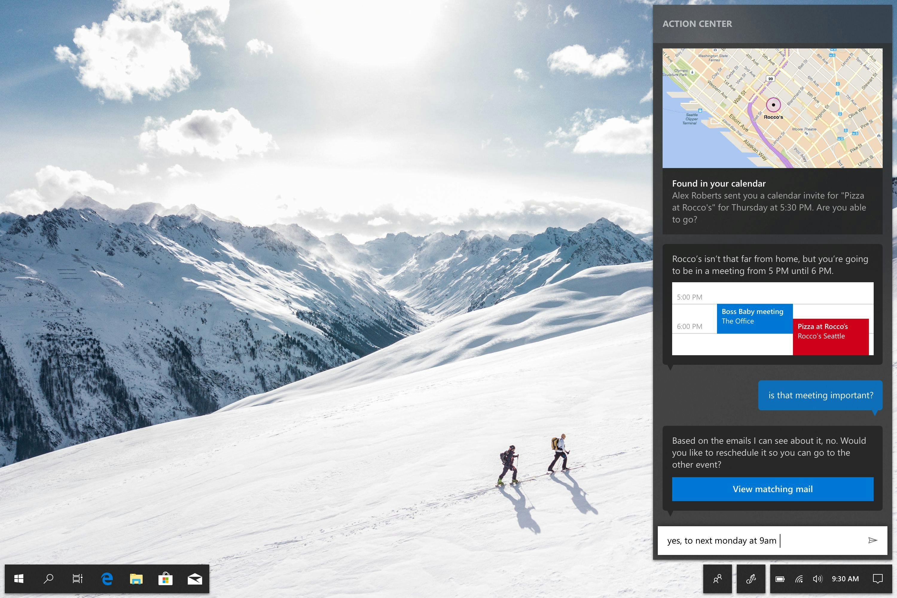
Talking to Cortana directly in Action Center.
At the bottom of Action Center sits the Cortana text box, the same one removed from the taskbar earlier in this concept, now in a place where the conversation can be preserved. Typed queries render as messages; Cortana's replies render inline. Scrolling back surfaces previous exchanges in their context, the way every other chat surface on the user's phone already works. It also aligns with how Cortana already exists as a bot in Skype, keeping the metaphor consistent.
The button-and-popup model of an assistant always felt like a compromise. Conversations belong in a conversation surface.