I currently work on Windows, where our team focuses on making your PC experience more powerful and delightful with AI, while also scaling new tooling across the studio.
I'm a self-taught designer with an engineering background, specializing in simple and effortless experiences for both the devices we use today and the ones we'll use in the future. Crafting high-quality products that people love to use is my passion, and I work tirelessly to achieve that goal.
Using the medium of motion and rapid prototyping I bring these experiences to life, visualizing the smallest interactions to entire user journeys. I strongly believe in open design, and encourage co-creation that can help deliver a better solution for users.
Accessibility and inclusion sit at the center of my process — technology should empower everyone and nobody should be left with a subpar experience.
I'm currently a Senior Designer at Microsoft, where I currently work on Windows AI.
Previously a Design Intern at Microsoft, where I was involved with products used by millions of people around the world. Check them out: Surface Duo, SwiftKey, Fluent Icons. Before that, I worked independently on critically acclaimed concepts both by myself and friends.
BSc Computer Science graduate — First Class Honours.
Awarded 2018-19 Microsoft MVP (Most Valuable Professional) for Windows Design.
One-handed navigation and feature parity with Edge on desktop.
Not affiliated with Microsoft
Microsoft Edge for iOS redesign isn't affiliated with Microsoft. Concepts and mockups shown do not represent any product plans past, present, or future.
Microsoft Edge for iOS in 2019 has two gaps worth closing.
The first is that it sits behind its desktop sibling on most of what makes Edge distinctive: Cortana-powered search suggestions, cross-device tab sync, inking. The desktop version has all three; the iOS version doesn't yet.
The second is broader. No mobile browser, Edge included, has adopted the best mobile navigation model the industry has produced. Windows Phone had it right years ago: every primary control at the bottom of the screen, where the thumb actually lives. Every iOS browser since has compromised, with an address bar at the top and a toolbar at the bottom, forcing the user's hand across the device to reach the thing they use most.
This concept proposes a version of Edge for iOS that closes both gaps.
Bottom-mounted navigation
The ergonomics aren't a research question. On our increasingly large phone screens, reaching the top edge requires the user to either re-grip the device or stretch a thumb across the screen. Both are interaction costs. The bottom edge, by contrast, is the most reliable target zone on a modern phone. The thumb returns there at rest, and Apple's own home indicator has anchored user expectation around the lower edge as the navigational floor of the device.
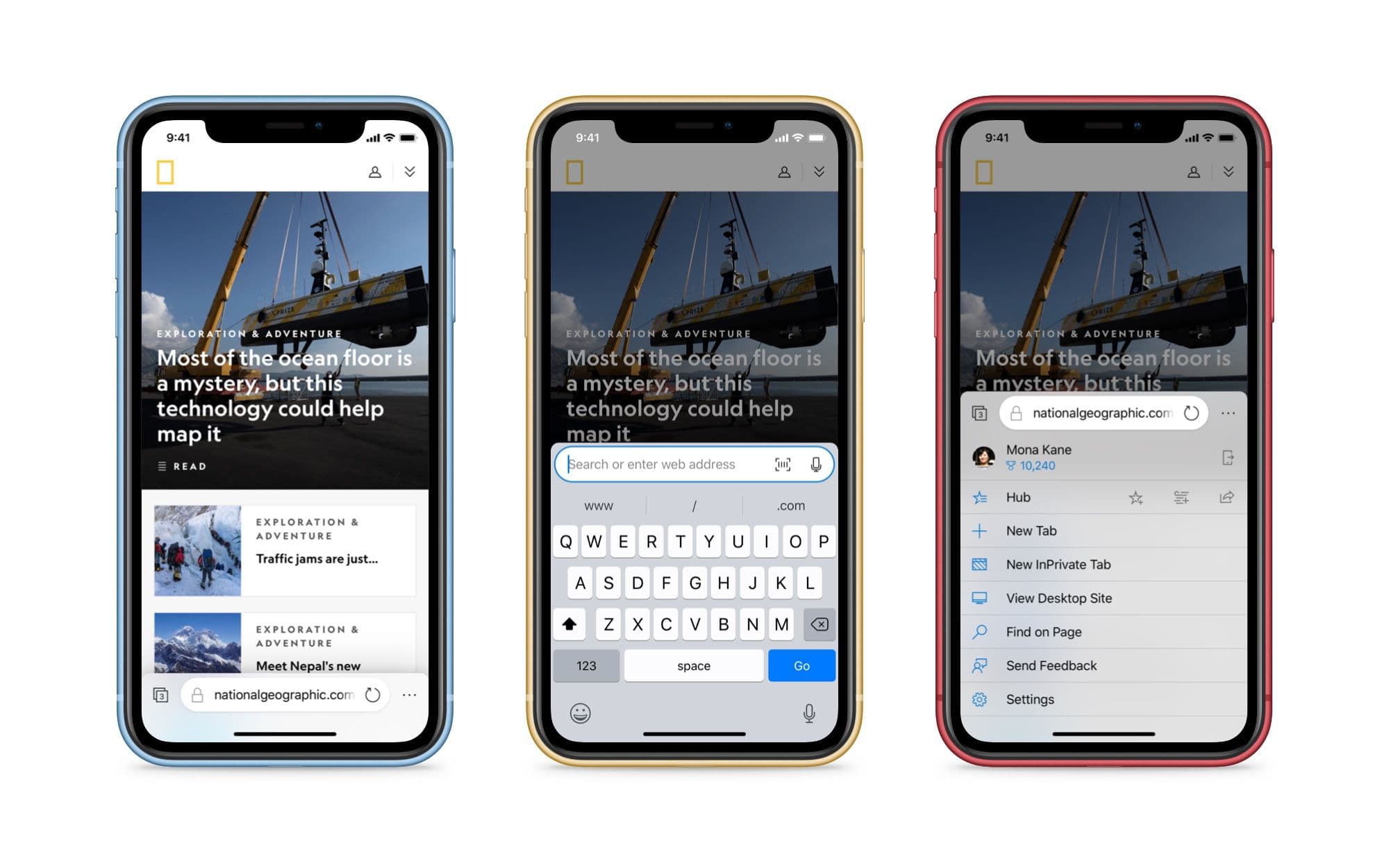
Edge's primary controls belong there: the address bar, tab switcher, and menu.
Bottom-mounted navigation puts every primary control under the thumb.
The menu slides up from the bottom rather than dropping in from the top, preserving the gesture geometry of the rest of the surface. Its items run full-width for larger tap targets.
Synced tabs
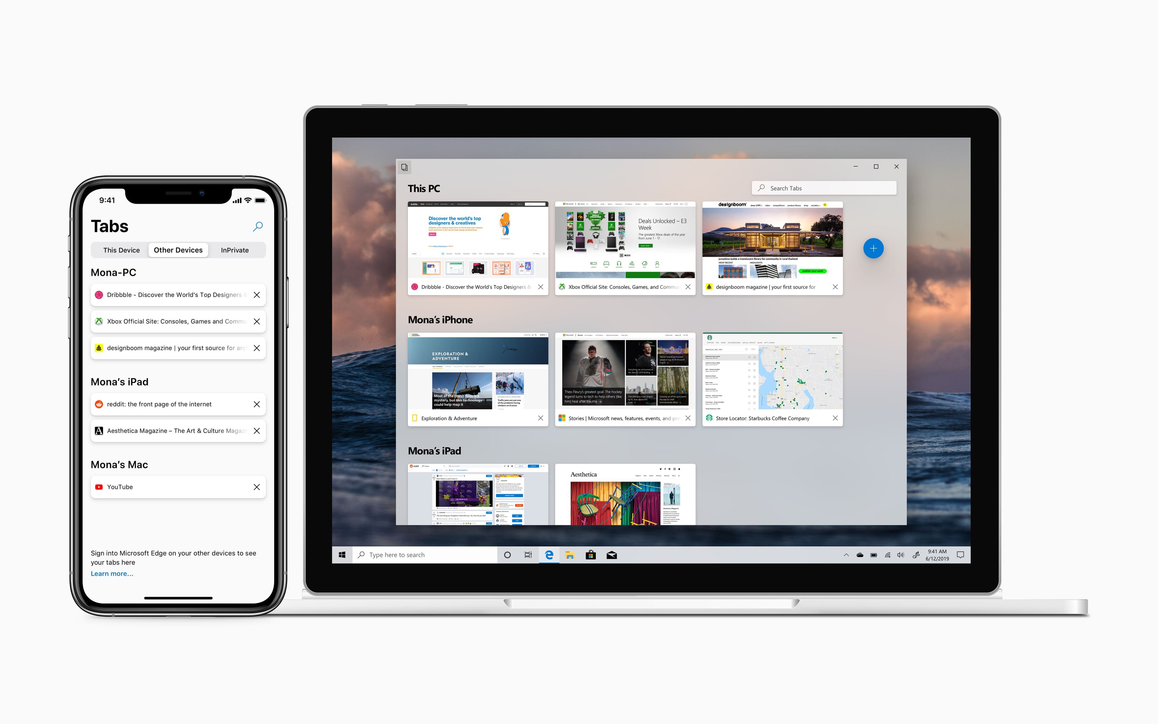
Internet Explorer 11 on Windows 8.1 and Windows Phone 8.1 had open tab sync between devices. Edge for iOS today syncs favorites and supports Continue on PC for handing a tab off, but it doesn't yet expose your open tabs across devices the way Chrome and Safari do. That's a feature-parity gap with both Edge's own history and the rest of the field.
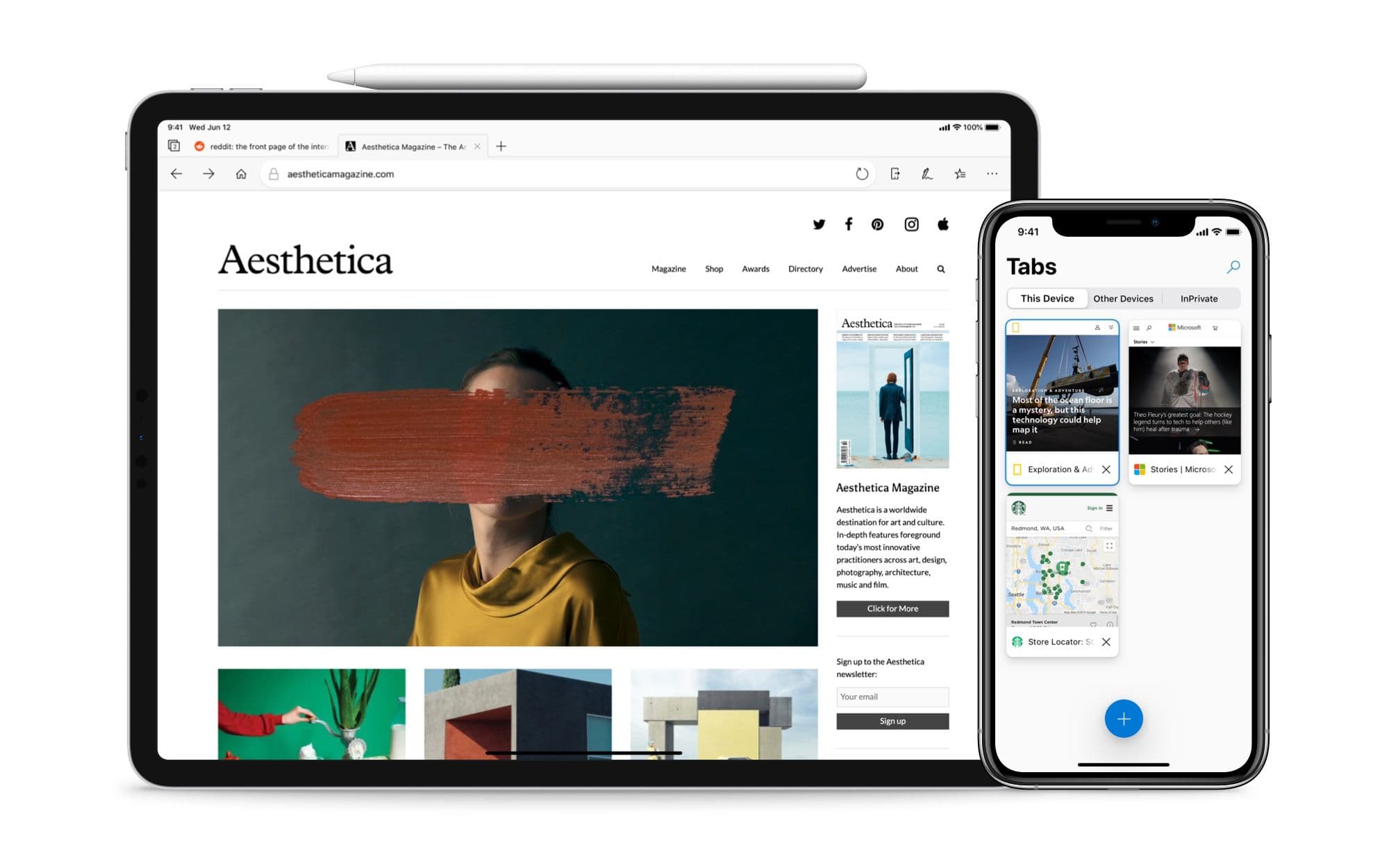
Tab syncing between an iPhone and a Windows PC.
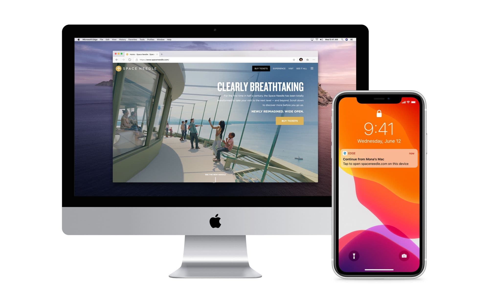
Closing that gap is straightforward. The interesting part is what becomes possible once sync exists: when a user has a tab open on one device and picks up another, a system notification offers to continue the session. One tap and the page is in front of them on the new device.
Picking up an iPhone session via a notification on a Mac.
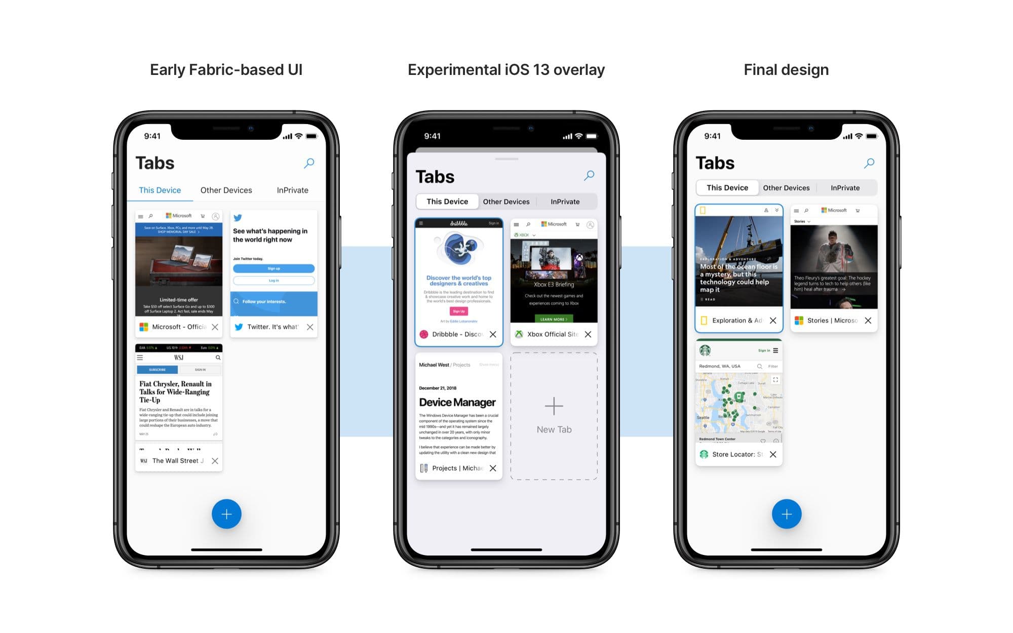
The tab view itself went through a few iterations. The earliest used Microsoft's iOS Fabric segmented control; the version that landed picks up the new iOS 13 segmented control with shadow depth, which sits more naturally next to Fluent's material language.
Tab view evolution, from the Fabric segmented control to the iOS 13 version.
On iPad, the tabs adopt the rounded corners of desktop Edge. The larger surface allows the desktop visual language to come across without compression.
The tab bar in Edge for iPad picks up the shape of its desktop counterpart.
Hub, settings, search
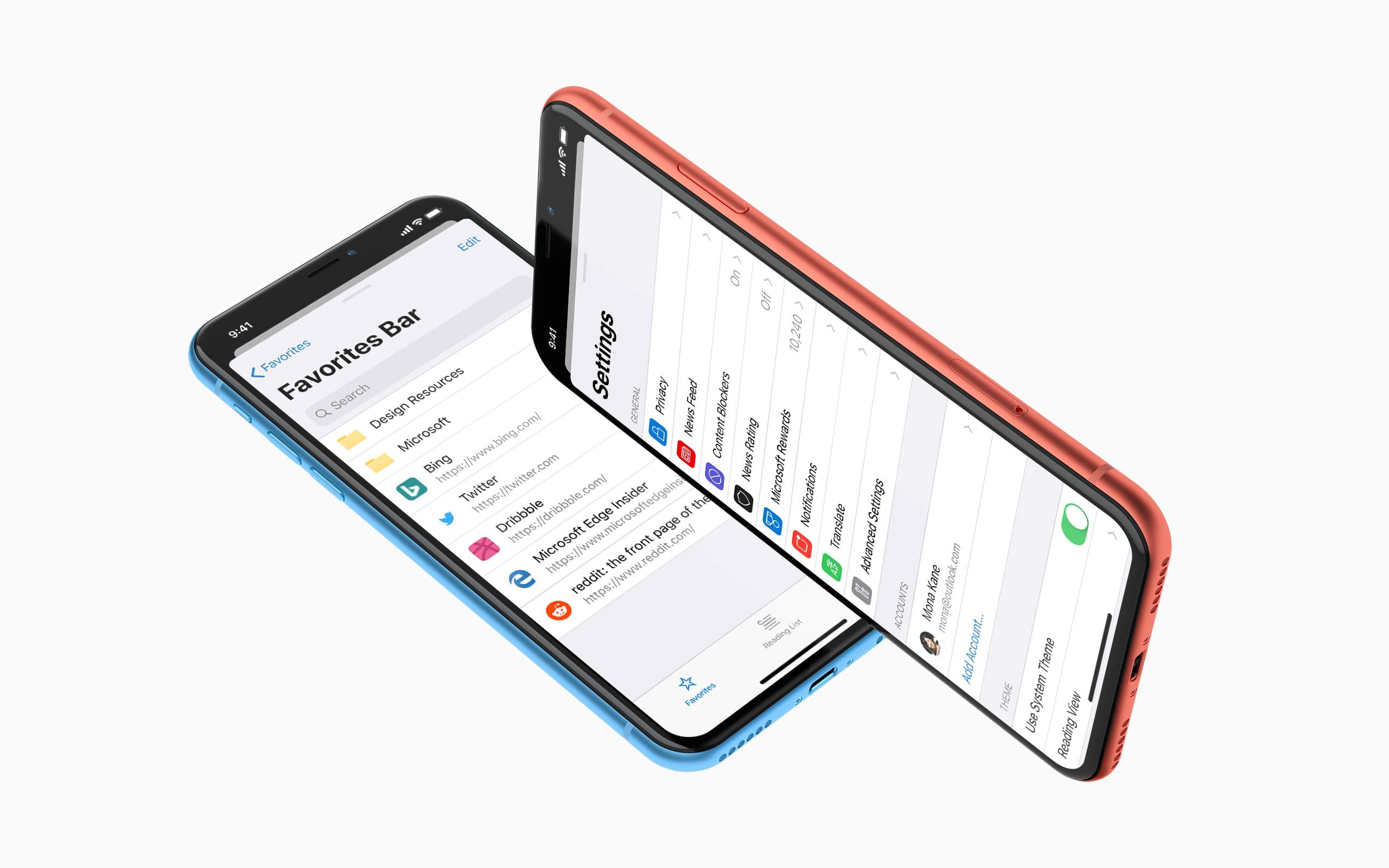
The Hub and Settings surfaces use iOS 13's new modal panel with a card-style sheet that sits in the foreground while the parent context is dimmed behind, swipe-down to dismiss. It frames both surfaces as temporary rather than separate destinations.
The Favorites section of the Hub and the redesigned Settings menu.
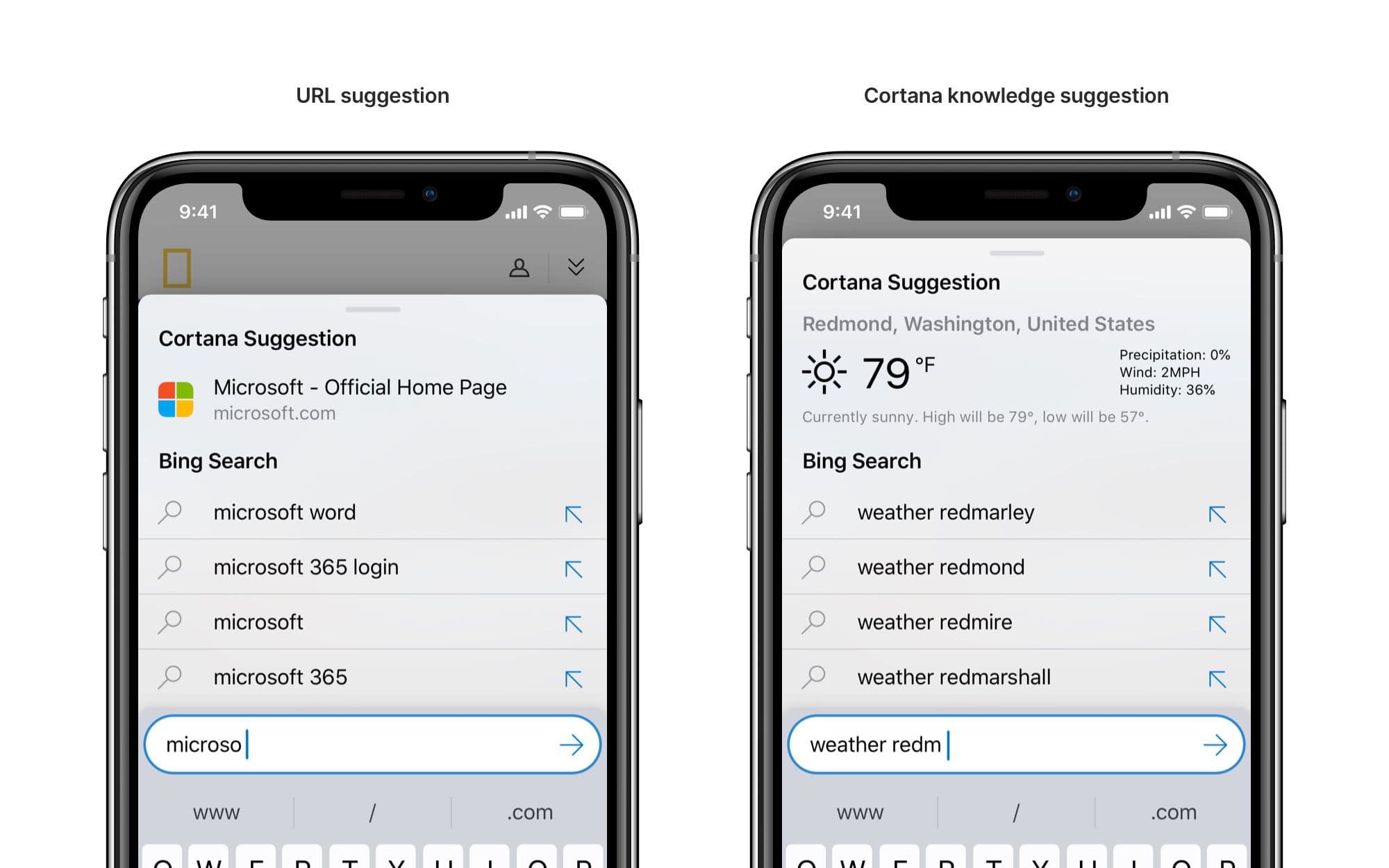
Search picks up a Cortana suggestion region, mirroring the suggestion area in current Edge for Windows. Edge desktop's search leans on Cortana to surface top sites and knowledge results and this brings mobile into parity.
Cortana suggestions in the iOS search experience.
Inking on iPad
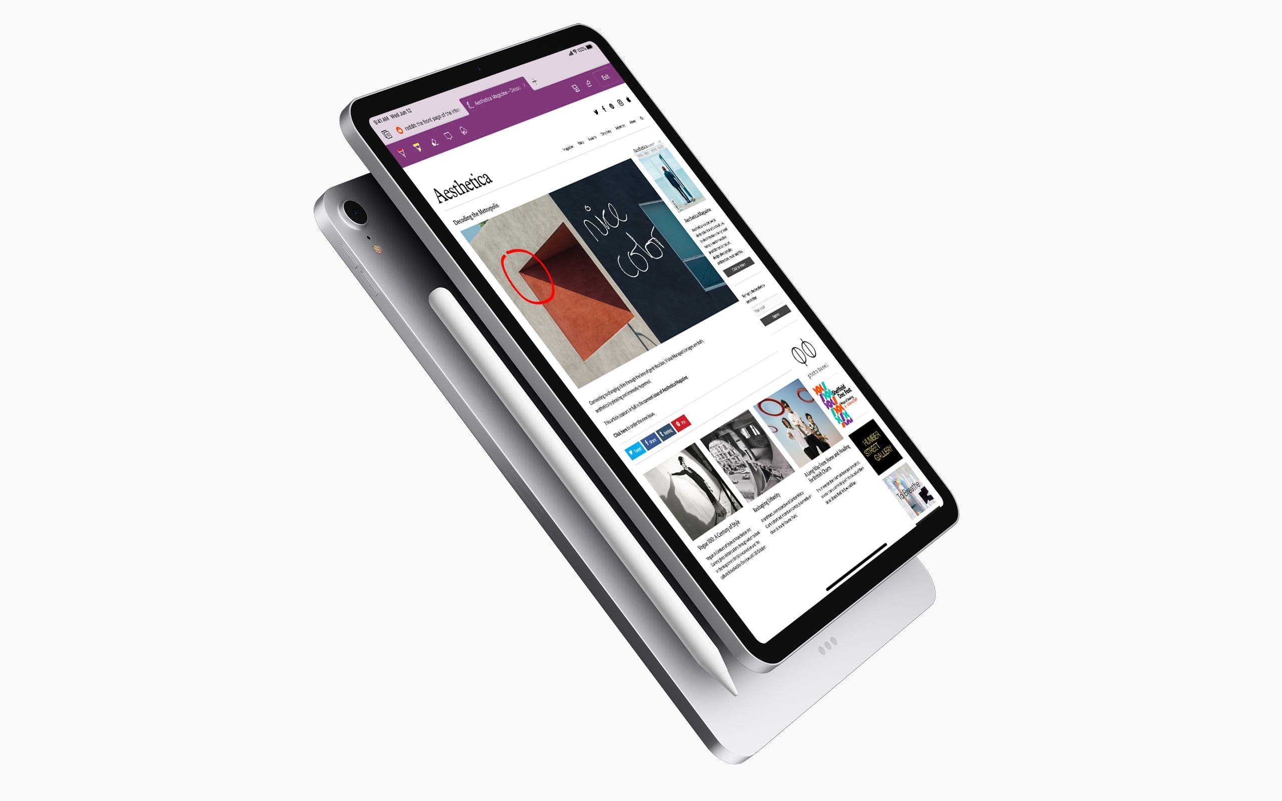
Edge desktop has had inking since launch. One click and you can annotate a page, save a Web Note, and share it. iPad has the surface and the pen support to make the same experience work, and arguably suits it better as a more deliberate annotation device than a mouse-driven desktop. The redesign brings the desktop's inking tools across.
Inking in Edge for iPad.
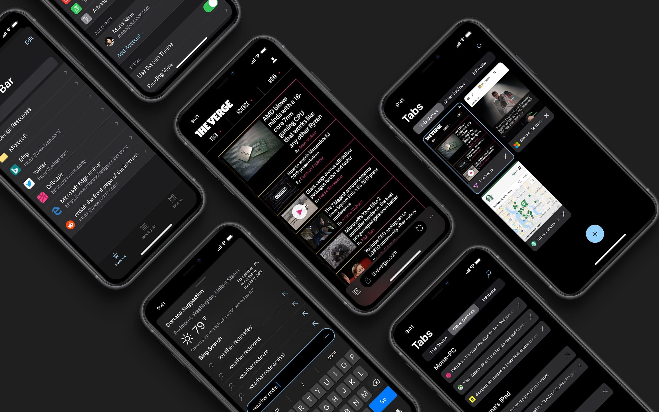
Dark mode for iOS 13
iOS 13's system-wide dark mode arrives later this year with its own treatment guidelines. The Edge dark interface gets a refresh against those.