Freelance Project —
Microsoft Store Content
Read Lessons from the Dark SideReimagining the Microsoft Store with new new featured apps layout and improved editorial content.
I worked with Ben Fox at User Camp to help reimagine the Microsoft Store with a new featured apps layout and improved editorial content. The aim was to take the best parts of the new Mac App Store in macOS 10.14 Mojave and apply them to the Store on Windows.
If you’re interested in reading more about this, I’d highly recommend taking a look at Ben’s blog post over on Medium: Lessons from the Dark Side.
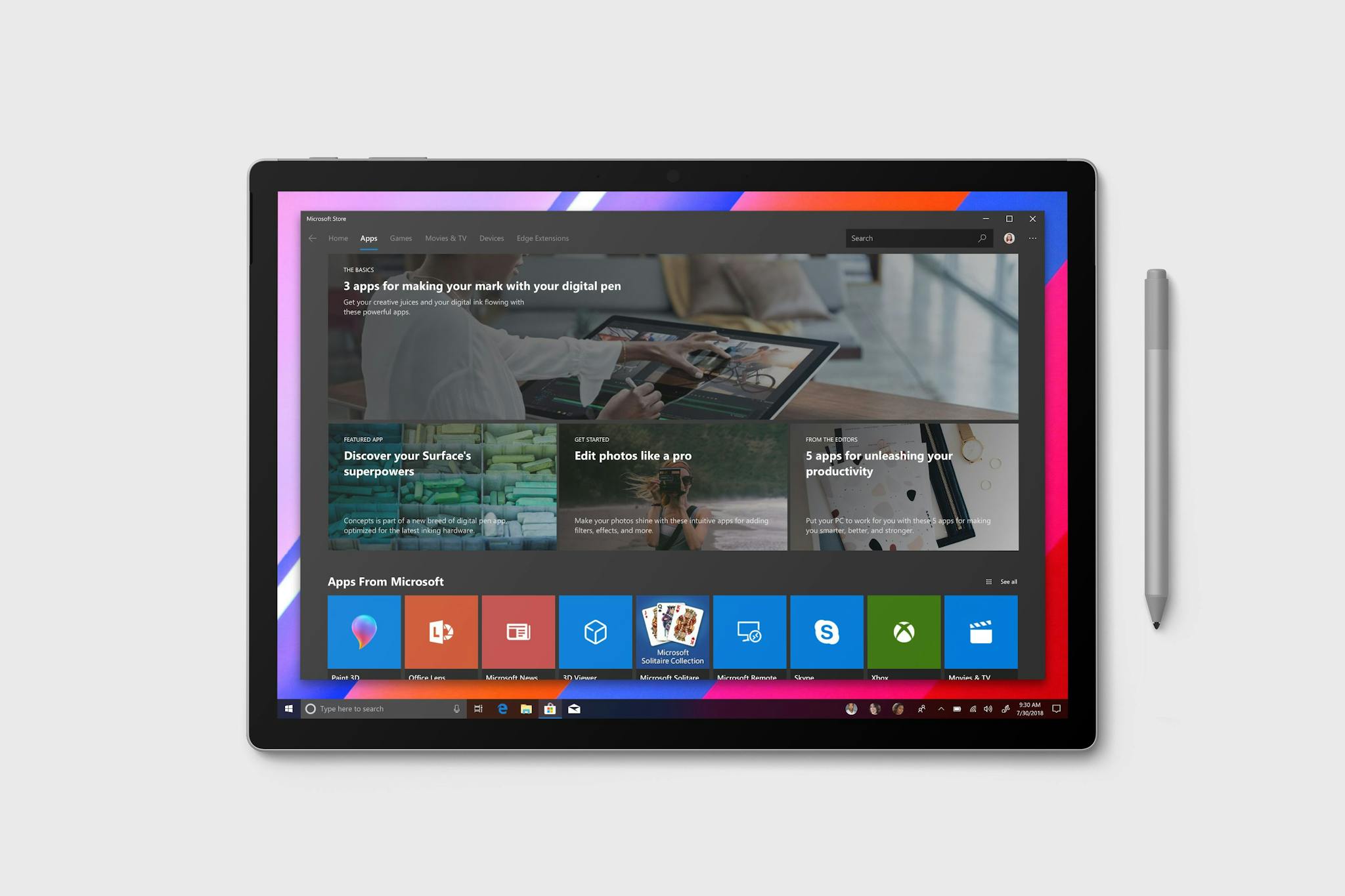
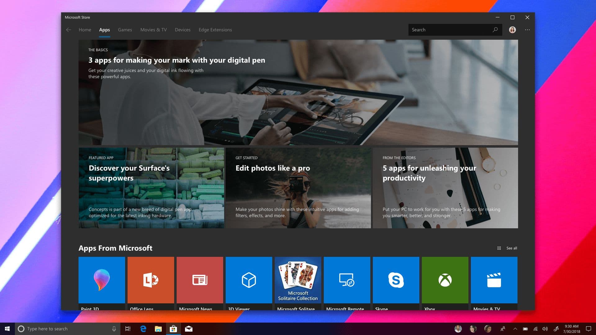
Discovery
There needed to be a way for users to discover the new editorial content. It made most sense to replace the existing hero elements on the Apps tab with stories about apps, developers, and more.
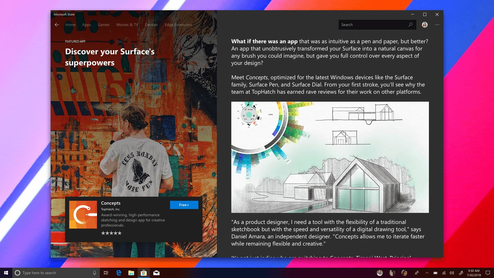
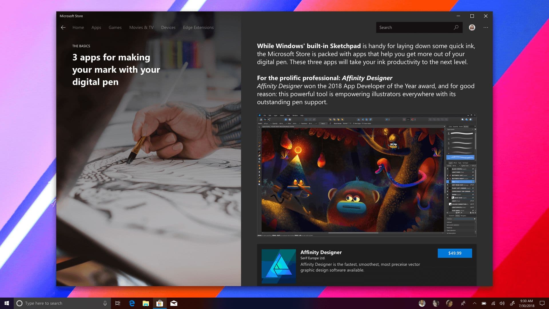
Featured content
Next, there needed to be a way of presenting these new collections and feature pieces. The design here mimics the Mac App Store, with a hero element on the left and scrollable content on the right. Users can install apps directly from the featured pages.
Apps can also be featured on their own: