Design Concept —
Redesigning navigation for Windows 10
Making in-app navigation fit in better with Windows Sets.
Not affiliated with Microsoft
Redesigning navigation for Windows 10 isn't affiliated with Microsoft. Concepts and mockups shown do not represent any product plans past, present, or future.
In this exploration, I wanted to see if the NavigationView in Windows 10 apps could be adapted to fit in better with "Sets".
I also wanted to see how hamburger menus could be re-worked by bringing them in-app.
Finally, I wanted to rework how users could open new applications in a Set, or start a Set quickly with applications they already have open.
Overview
I wanted to do this after seeing how Microsoft's new Sets feature was working with many of their in-box apps. There's a lot of clunky UI since lots of apps use left-hand navigation or some inconsistent variant of the top “pivot” navigation. My new design fixes the left-hand navigation issue by moving these links into a new consistent set of items at the top of the app.
The navigation items share a common look. In in-box Windows apps, they are 15 point Segoe UI with a 16px icon located 8 pixels to the left of the text - the addition of iconography helps the user visually identify what a particular menu item does. On the top-left is a back button—this is placed here since Sets does not allow for the back button to be placed directly in the titlebar.
In situations where more menu items are needed, the back button can be replaced with a hamburger button, allowing for a menu to be opened in-app. When the user navigates away from a main page, this hamburger button will convert back into a back button temporarily, allowing for navigation.
Photos
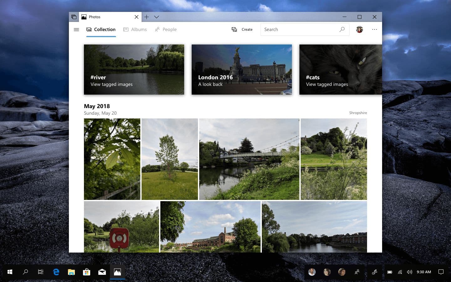
New pivot control and app layout
For the Photos app, I wanted to keep the existing top pivot layout, but make it blend in better with the rest of the app content. To achieve this, a white background has been used.
There's also a new general layout for the app, with a slightly refined carousel for stories and new headers for groups of photos.
Hamburger menu
A hamburger menu reveals more items to the user, such as options to filter by media type while also allowing them to manage things like shared albums.
It also shows top nav items that may be hidden due to the size of the window, such as in the screenshot below.

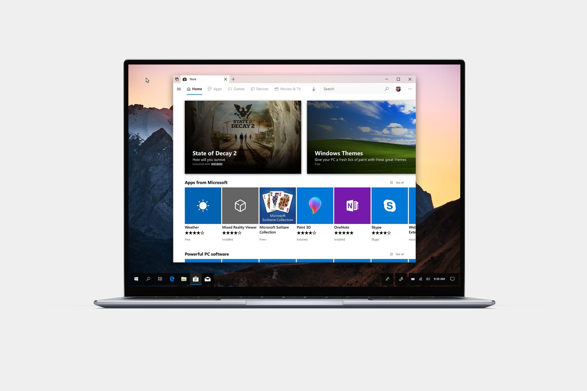
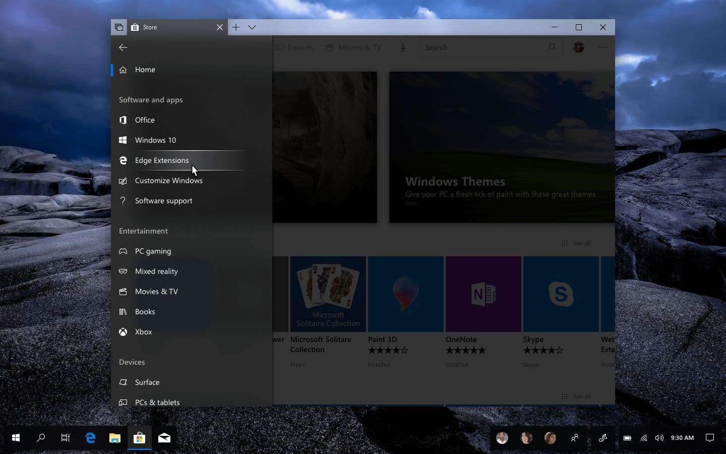
Microsoft Store
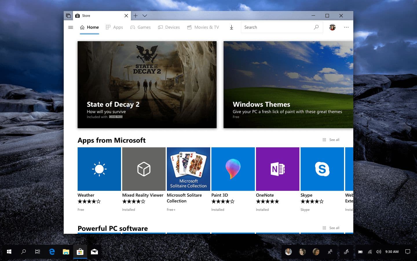
New featured carousel
For Store, I changed the featured section from a set of tiles to a carousel, allowing for potentially more items to be featured.
This carousel varies depending on the category being visited—some carousel cards may be smaller because the content is less important.
Navigation
Store uses the same new style of navigation that Photos used, except it's been tailored for the type of content the app contains.
The hamburger menu features the top navigation items as well as more categories to filter the Store by, for example extensions for Microsoft Edge, or specific types of hardware.
App case study
Starbucks UWP
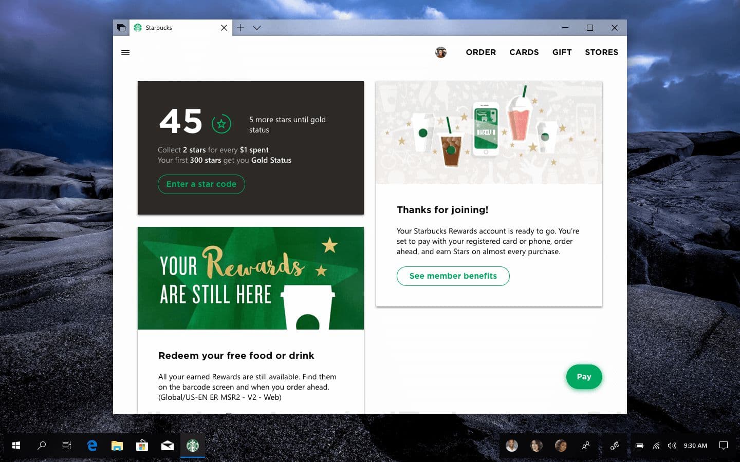
I wanted to create an example of a third-party application that used some of these new navigation and design principles. For this, I took Starbucks' Progressive Web App (PWA) and "converted" it into a true Windows 10 app that features Fluent Design.
Cards
Like in the Store concept, there's a new card-based UI here. In this example, cards are used to provide a "feed" of information about the user's account
These cards feature a mix of Starbucks' corporate font for areas of text that need attention drawn to and the platform-native Segoe UI for all other text.
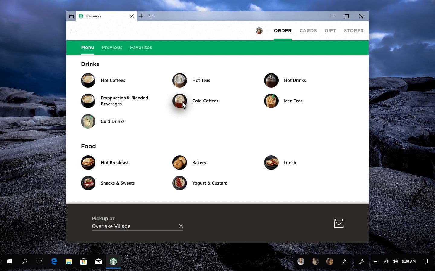
Adapted navigation
Unlike the other concepts, the navigation view here doesn't use iconography, keeping it in-line with the look of Starbucks' web app.
There's also "nested" navigation on the Order page, a secondary horizontal NavView is placed below the main one, distinctly separated by shadows and brand colors.
Sets navigation
While not strictly related to NavigationViews within apps, I also have designed a couple of new Sets scenarios for adding apps to an existing set or creating a new one.
Adding apps to a Set
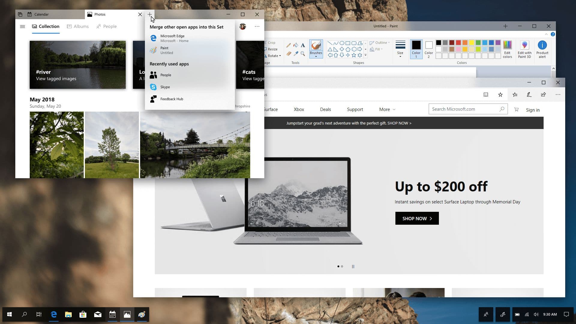
Right now, if a user wants to add existing apps on the desktop to a Set, they have to go to the app itself and drag its tab into the tab bar of the Set they want to add it to.
With a new interface that appears when the user hovers (or potentially right-clicks) on a tab, they can choose from compatible apps that are already open or quickly launch one of their recently used apps. In the example above, you can see how Paint and Microsoft Edge are listed as apps that can be added to the existing Set of Calendar and Photos.
Quickly creating a new Set
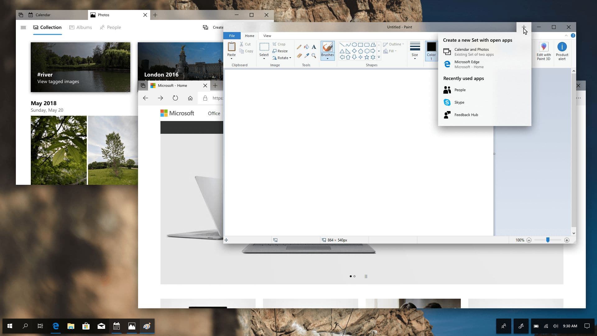
Creating a new Set is currently a little bit easier than merging existing apps—simply click the new tab button and choose the app you want—but I still believe that this can be made even easier by allowing the same menu for merging appear when you hover on the new tab button for an app that’s on its own.
The interface is very similar, except it indicates that a new Set will be created from the apps a user chooses—they can even create a new Set with an existing Set (as you can see).
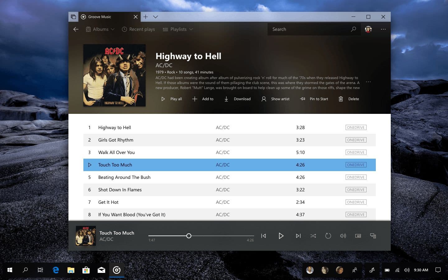
Groove Music
Finally, here is a design that shows how images can bleed through the NavigationView and into Sets tabs, creating a very seamless look for apps.
Final remarks
I believe these new navigation and design principles help keep in-box apps looking consistent, while also helping third-party apps create a style that fits their brand (as shown in the Starbucks concept).
These new designs also show off new concepts, such as redesigned carousels, better in-app hamburger menus, and a cleaner look for Sets.
Meanwhile, the new Sets concepts show easier ways of getting things done on Windows, allowing users to bring apps together in logical groups—one of the main ideas behind Sets—even faster than they can right now.
If you liked this UI exploration, take a moment to share it on your favorite social media platform—it means a lot.
Thanks for reading!